


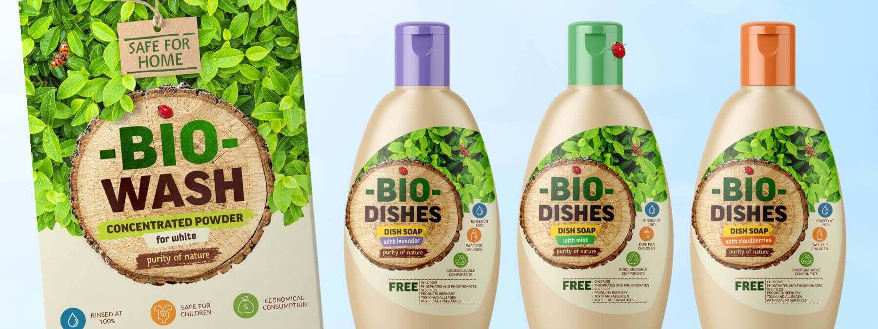
Mini-packaging design: what to consider?
☝️ There is not enough space, so we don’t split it up!
• Large logo
•Large product
That’s it!
Follow the rule:
the smaller the packaging, the more noticeable the brand, most often a recognizable logo on the background of the corporate color will be enough. This is what all market leaders do.
Secondary — down with it!
There’s a back for that
Important:
☝️ we do not complicate the life of the consumer — the design of the mini-package according to the main criteria (brand, color, style, font) should be identical to the design of the full-size version. Otherwise, two sizes of the same product will be perceived as different goods: remember, there are only a few seconds for identification (especially this applies to the checkout area!) Keep in mind:
the word “mini” on the packaging is often perceived as a defect — be careful, the buyer already sees that this is a smaller version 😉