
At the initial stage of creating the design, you need to immediately think about HOW everything will be implemented and what materials are planned to be used in order to create an effective packaging and win the attention of the buyer. It can be a stylish special finish, a variety of nano-foil, designer cardboard with unusual properties and much more.
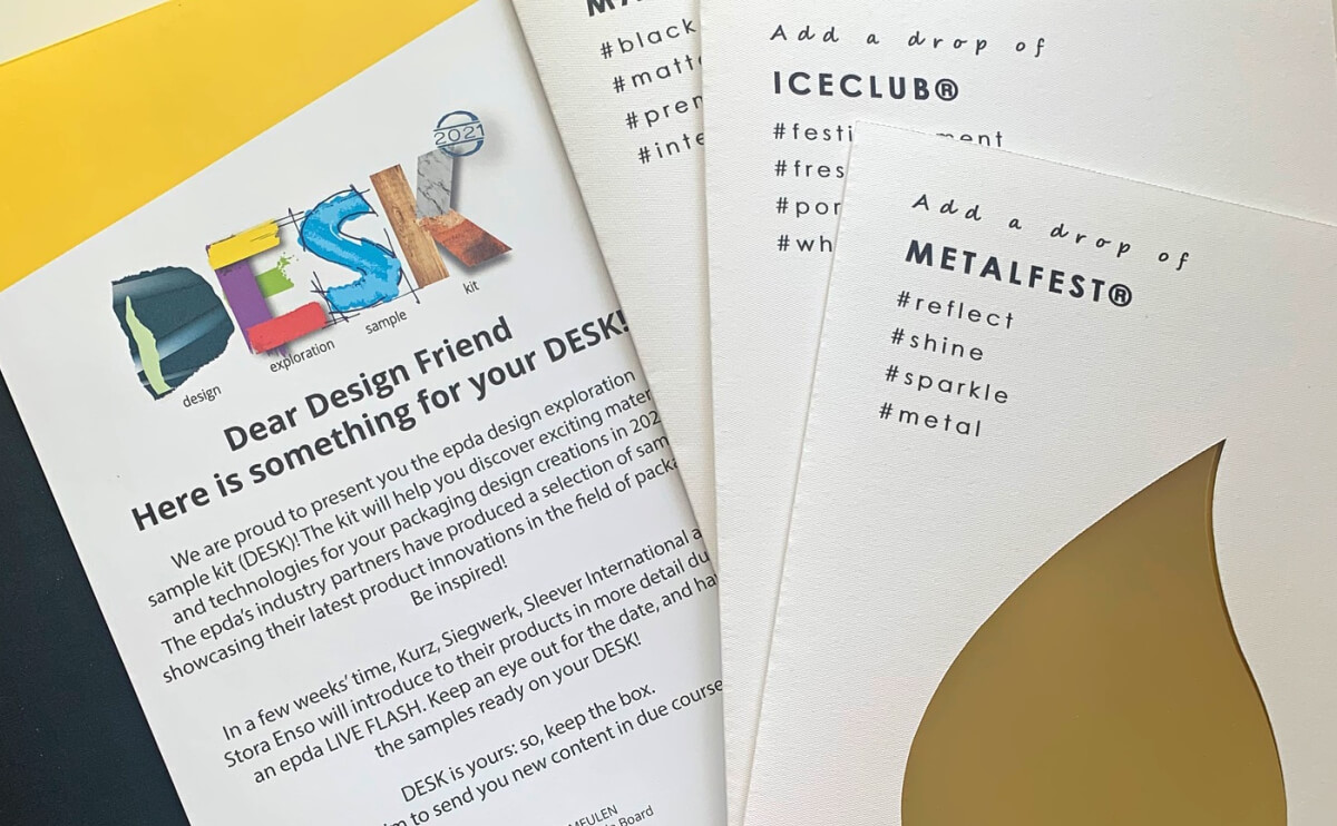
In May, EPDA* made a surprise in the form of another package with a description of the latest trends and a whole box of relevant materials for use in design.
These are samples of various designer cardboard, imitation leather, the warmth of velvet, and textured craft — a combination of sensory and visual: for a new format of relations between the brand and the client. As we know, the tactile component in packaging design is an important point!
A lot of metallic textures — the intensity and brightness of metal is presented as a symbol of luxury and sophistication.
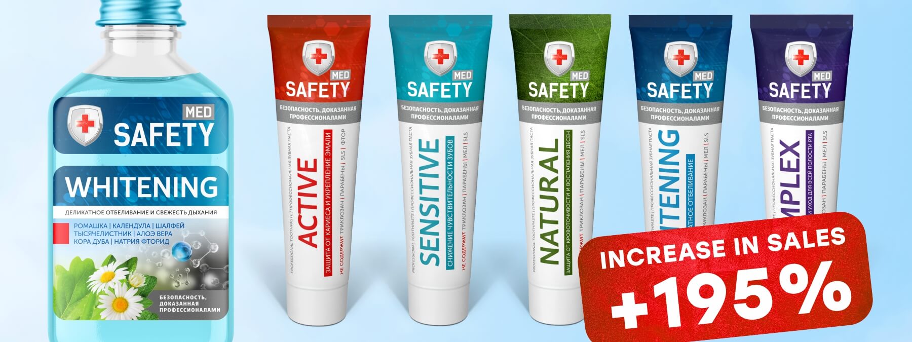
Color samples. There are really a lot of them and they all look identical on different bases. Color rendering plays a key role in brand communication. The importance of color stability on various media is emphasized: whether it is branded packaging, an advertising booklet or souvenir products, the color should be unchanged regardless of the characteristics of the surface on which it is applied. It is the color that increases brand awareness (Coca-Cola, Tiffany, Milka — color rules here and it should always be perfect, this is the face of the brand). As we know, not all printing houses and ink manufacturers manage this.
A lot of attention is still paid to the black color: there is both a matte and a rich black finishes inspired by the codes of modern and luxurious design. Matte black remains a symbol of premium packaging.
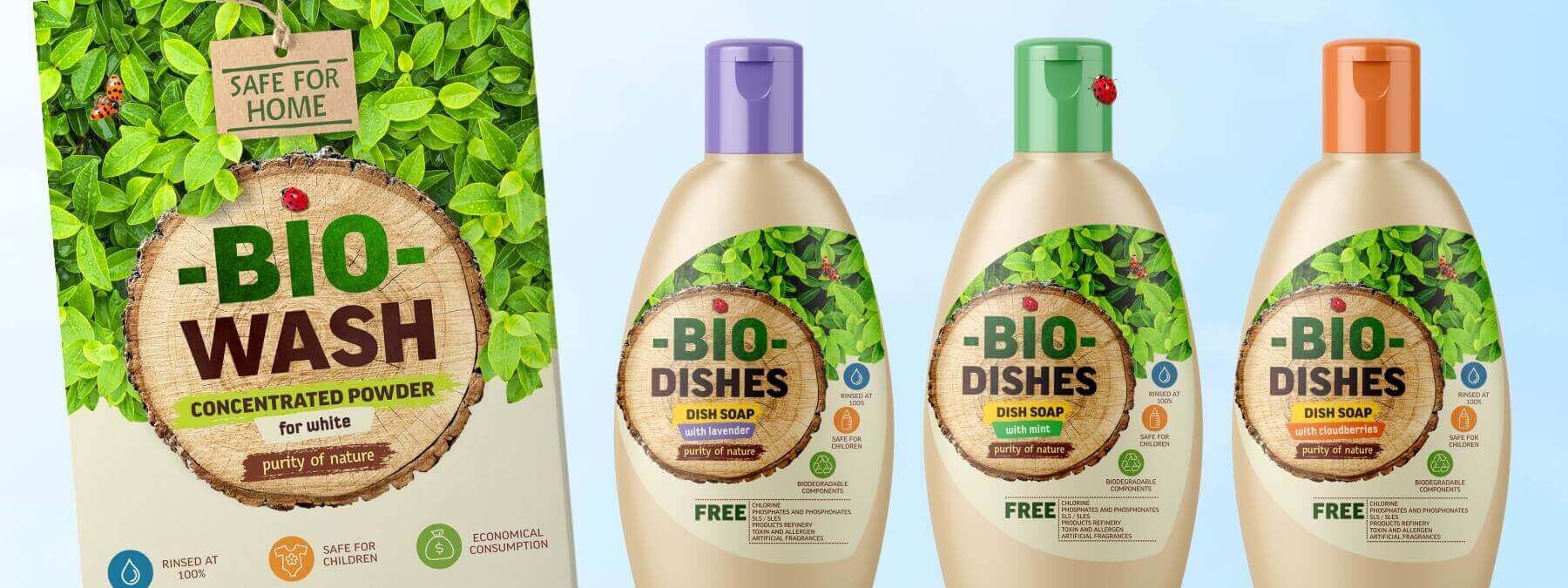
In the premium segment, cold white is also relevant: imitation of an ice background is now in trends, as is the noble effect of porcelain.
All this can be achieved now by turning to professionals and using new materials and technologies. The main thing is that the use of a special finishing looks appropriate and increases the value of the brand.
Moderation is good in everything.
*European Brand & Packaging Design Association